The exhibition/gallery I looked at is an online creative arts
website called behance.net. The site allows users to upload their own projects
whilst also being able to view other artists portfolios. I chose this over a
traditional exhibition because it allows the audience to see what they want and
doesn’t put the restrictions on you that a real gallery does. I used the
website to look at recently completed graphic design projects and looked at the
ones that interested me or the projects I felt best represented my interests in
the field of graphic design.
I started by
looking at the work of Ian Jepson a graphic designer from Cape Town, South
Africa and his posters for the event ‘it came from the jungle’ I was drawn to
this poster by its clarity, colour scheme and overall easiness consume. Its
vibrant colour scheme and eye catching central image make this poster really
leap off the page and conveys a great image to the audience. It feels like a
completed image there is no boring space it is a very vibrant poster corresponding
to the theme of the event it is promoting. All of the artwork is relevant and
helps to draw the audience in powerful colours are used to display information
against a dark background.
Next I looked
at some work from Florian Schommer a German
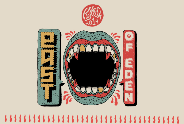
graphic designer. I looked at his piece ‘east of Eden’ an alternative graphic
illustration created for ‘kiosk’ I really enjoyed this illustration, it is a
non standard form of design it is quite abstract and resemblant of the Russian
constructivist style but uses a range of colors and techniques to create a
vastly complex yet interesting image. Each color compliments the next creating
a very aesthetically pleasing final piece. I really enjoy this alternative abstract style of cartoon,
it provokes a lot of thought and is a very unique style in which to display
information and make information fun and available.
Finally
I looked at some work from Indian graphic designer Shaivalini Kumar and her
‘decorative type’. This form of modern typography is really interesting and
creative. Each letters motif is derived from traditional patterns and a vibrant
contemporary style. The final result is an alphabet that really leaps off the
page and catches its audience’s attention. The complex designs appear very
simply on the page and appeal to a huge audience. Kumar’s color scheme is
another thing to be admired; every last bit of color is perfectly placed in
order to create a resounding full image. I really like this modern style of
typography with color and pattern it is eye catching and widely applicable to
many different products. For example some of shaivalinis lettering has been
printed onto mugs, this is just one use of her incredible designs. Application
is something very important in today’s design industry, if you’re design has no
application then there is no point in the illustration. Usability plays a key role in the
marketing of any product kumar clearly keeps this in mind when designing any
project.


No comments:
Post a Comment